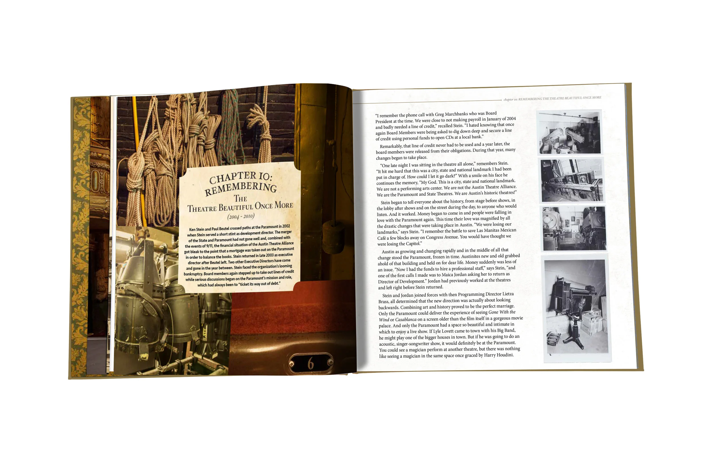
The Paramount Theatre, built in 1915, is an Austin icon. To celebrate their centennial, the theatre decided to have a coffee table book made. I was brought in on the project by an art director about halfway through and was tasked with designing the remaining book, as well as the cover. This was such a fun project to work on, as I learned so much about the history of the theatre.
The book is currently with the editor in its final stages and will be printed soon. Be sure to get your copy!
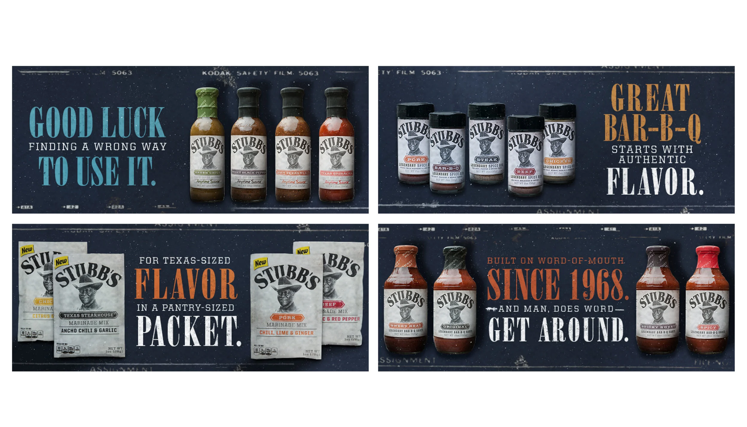
Created by C.B. “Stubb” Stubblefield in 1968, Stubb’s BBQ Sauce is an internationally-recognized brand out of Austin, TX.
In 2015, I was brought in to co-concept and design their social media posts as well as a handful of printed promotional pieces. Several social media posts were taken further and made into fun promotional pieces. For a holiday post in 2016, I designed Stubb’s wrapping paper which was loved by the client so much that we printed rolls of it in-house and wrapped promotional giveaway items to send to loyal Stubb’s fans. Another social post that became interactive was Valentine’s Day. I created cute BBQ-themed valentine’s that fans could share socially or download and print at home.
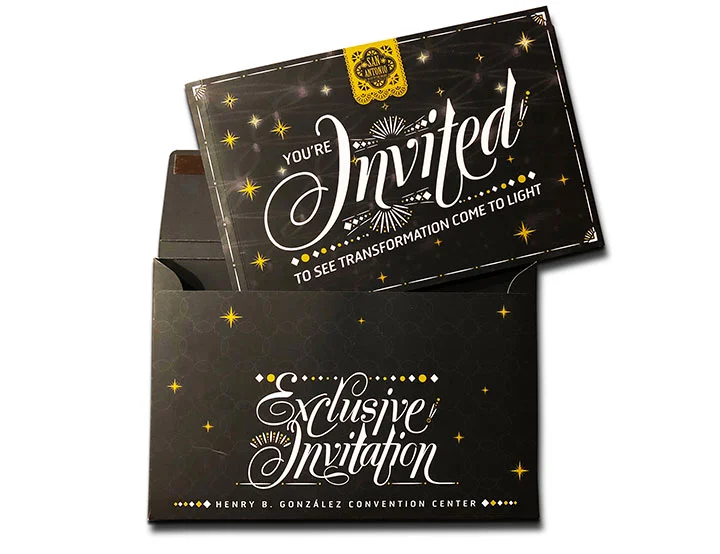
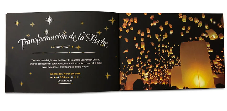
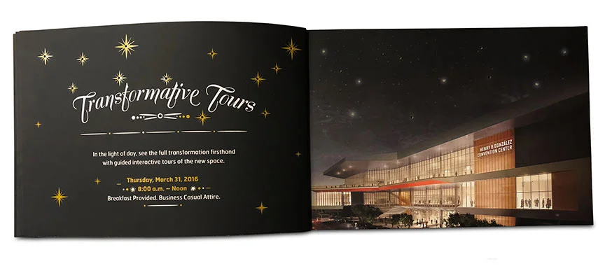
In 2016, the newly-remodeled Henry B. González Convention Center opened on the San Antonio River Walk. An extravagant gala was held in the theme of “transformation” in the new ballroom and the evening ended with guests lighting and releasing luminarias into the night sky.
Because the invitation needed to be printed before the renovations on the convention center would be complete, I was tasked with having to use building renderings. I wanted the invitation to be as grand as the gala, so I created a 3-page, interactive piece complete with a soft touch varnish, gold metallic ink and blinking lights. The lights, which activated once the invitation was pulled out of its envelope, were built in to the back page where they would twinkle as part of the night sky above the convention center. The first and second page were die cut to allow for the lights to show on those as well. For the first page, they were incorporated into the ballroom’s ceiling lights and on the second page, into the luminarias that would be released at the event.
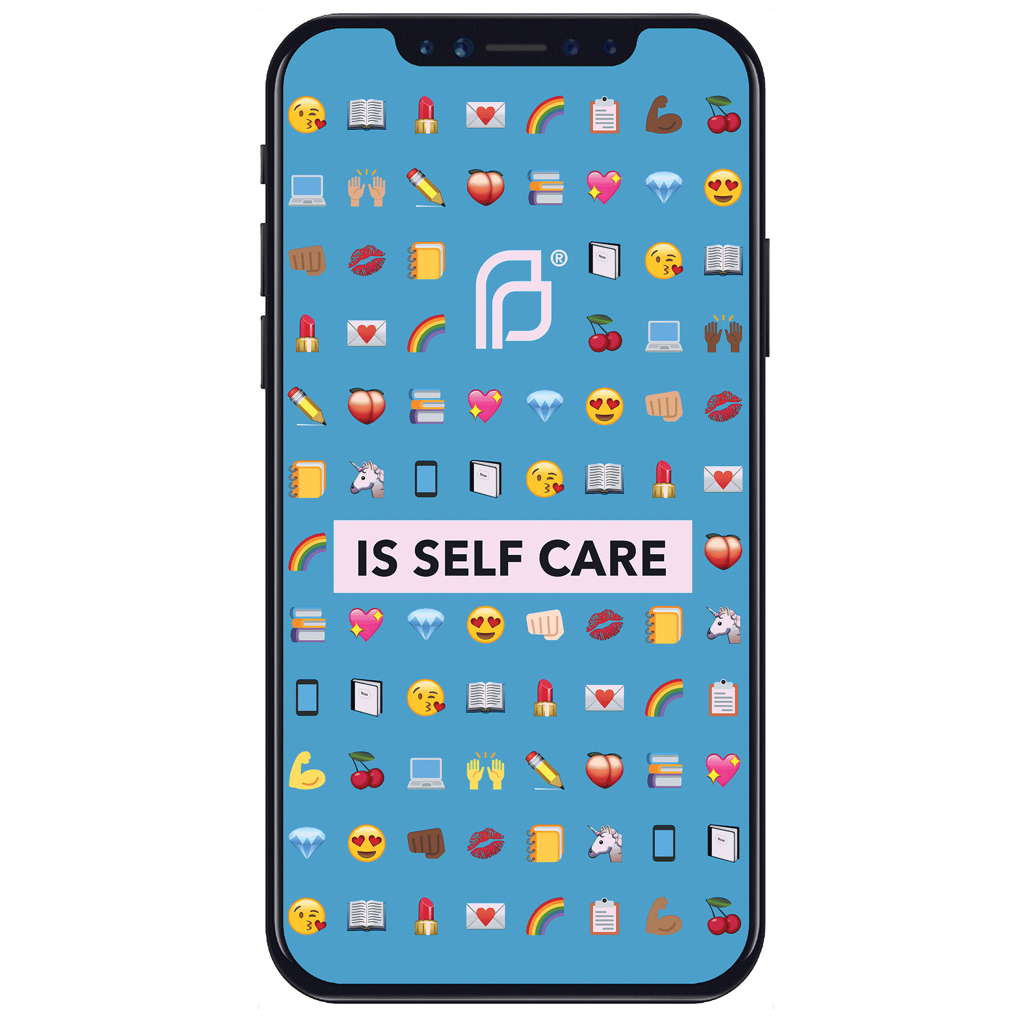
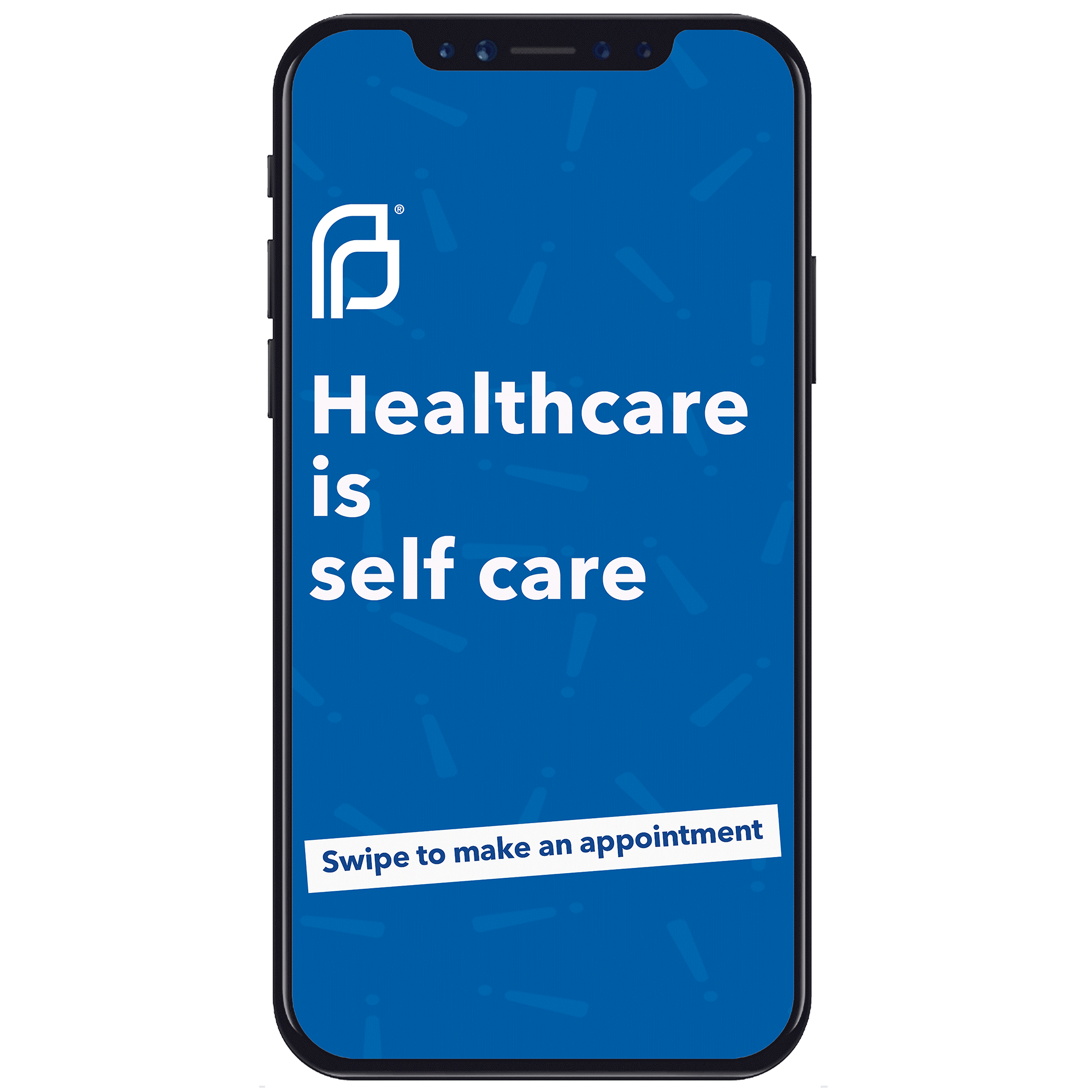
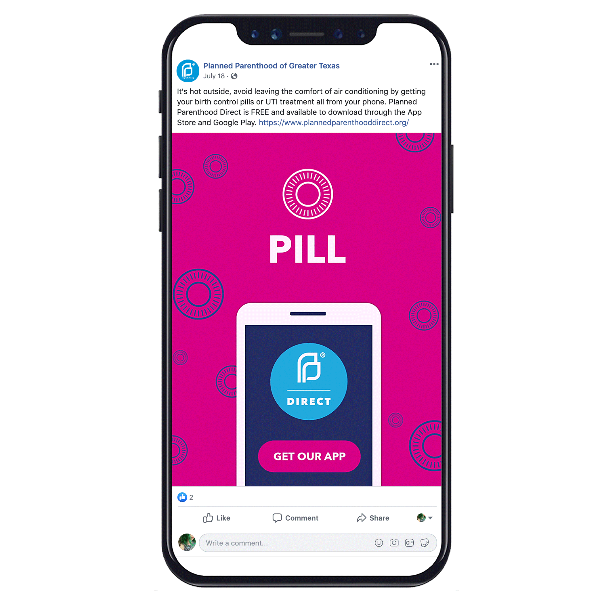
I’m a proud supporter of Planned Parenthood of Greater Texas.
I worked with them to create several social media campaigns and event promo pieces to raise awareness of their affordable healthcare services and education.
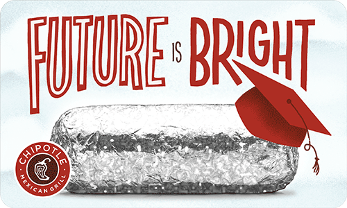
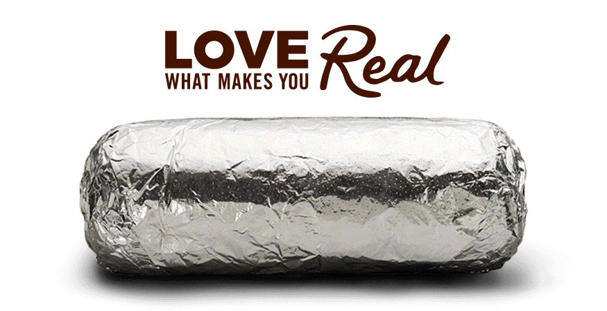
Prior to working on the Chipotle account, I had actually never eaten Chipotle. I’ve since made up for that and can now declare myself a Chipotle expert.
One of the things I love about this client is their determination to make, not only the workplace but the world a better place.
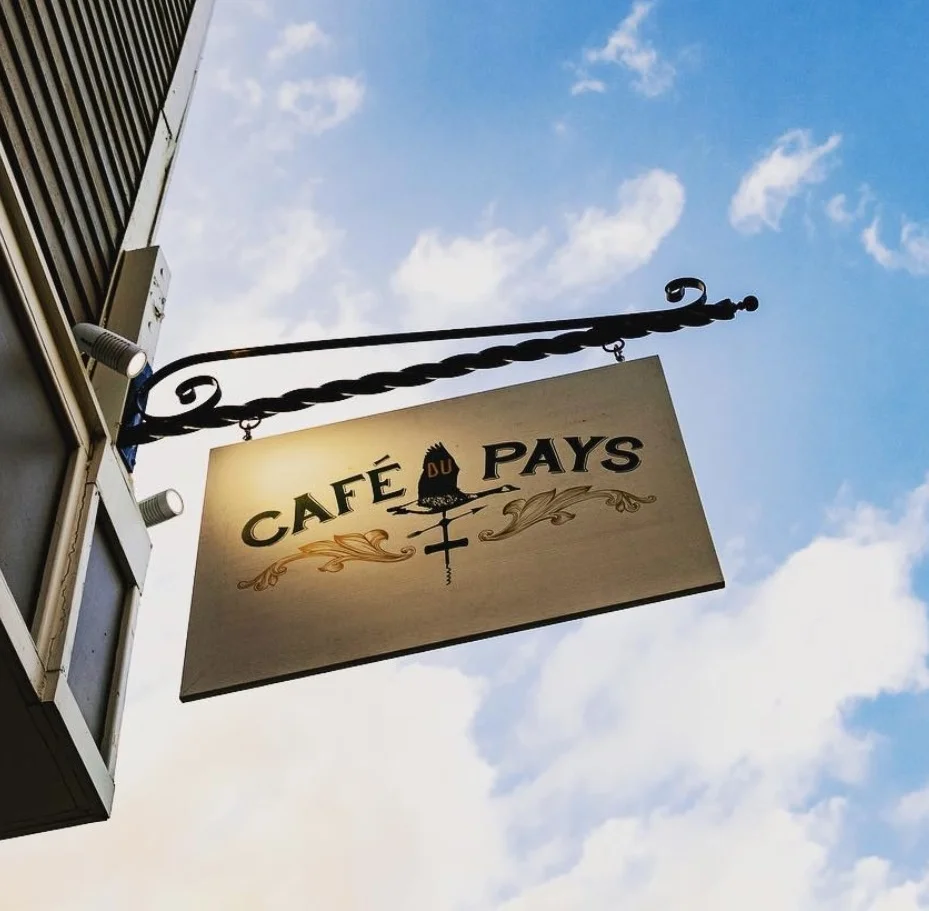
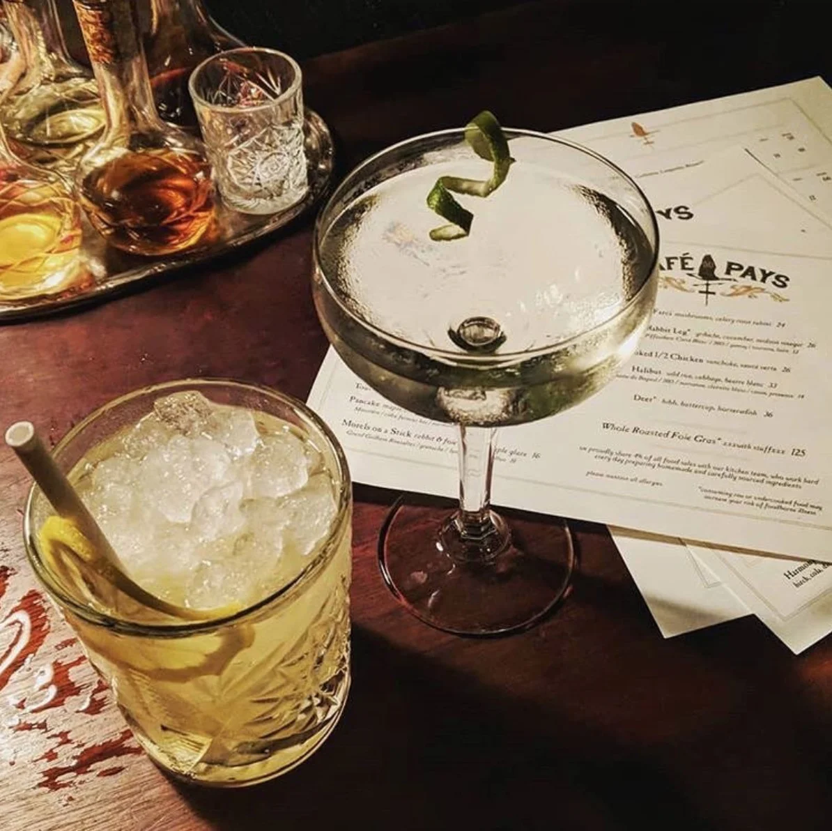
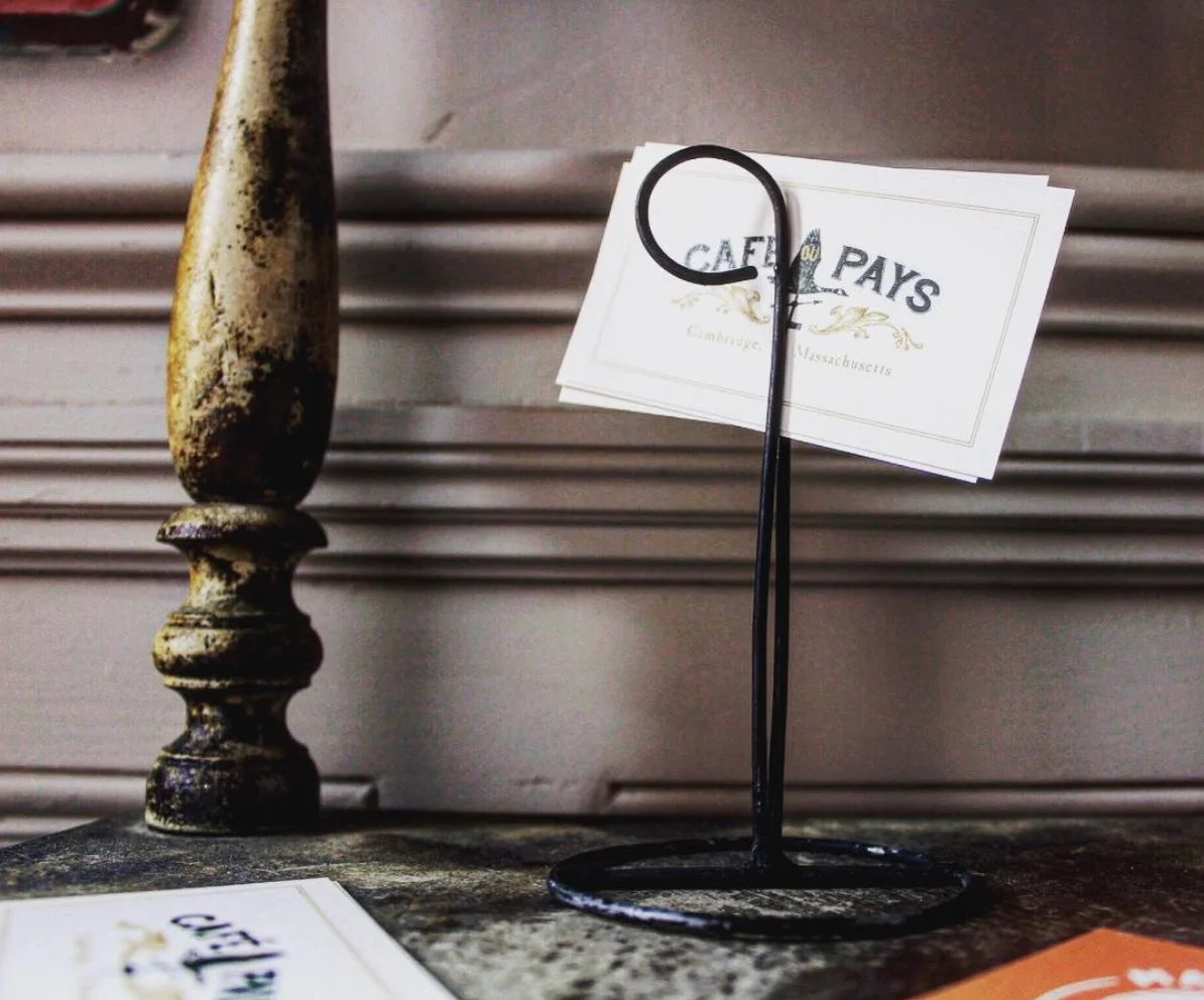
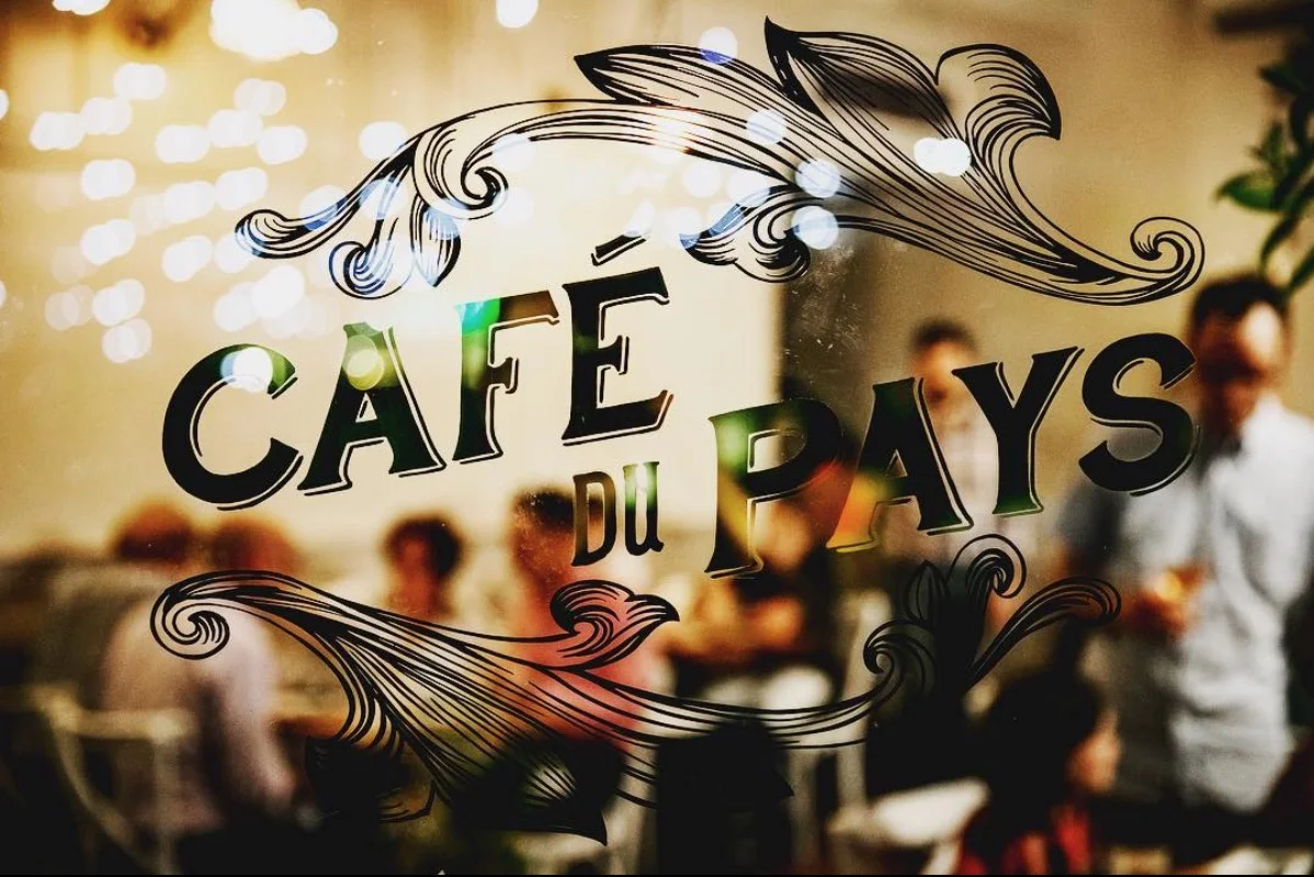
Recently ranked the “top new restaurant in Boston” by Boston Magazine, Café du Pays is a French-Canadian restaurant in Boston, Massachusetts specializing in upscale country cuisine.
I was contacted to create a logo, signage, menus and paper system. The logo is centered around a weathervane made up of a Canadian duck, a corkscrew and a fork and is rustic, yet stylish.
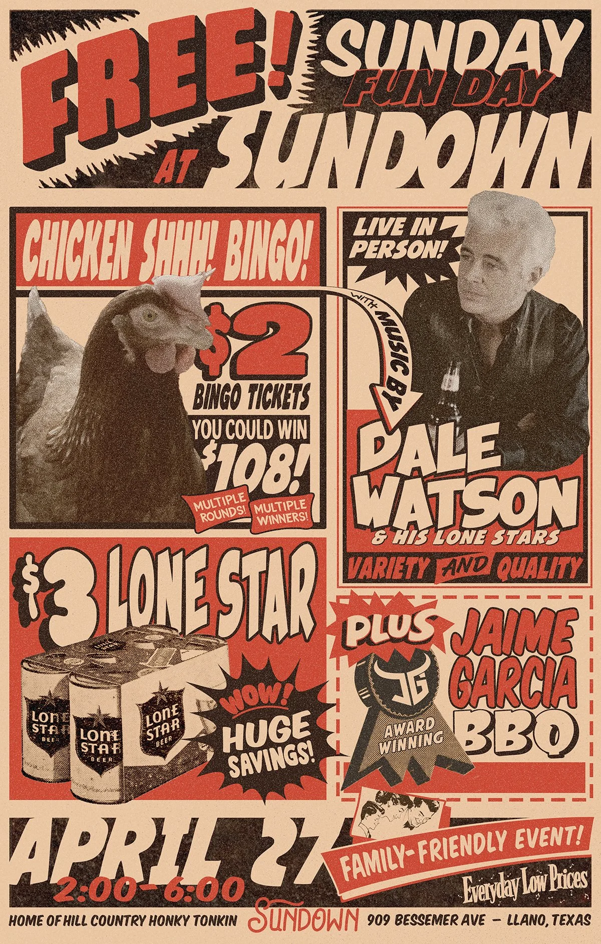
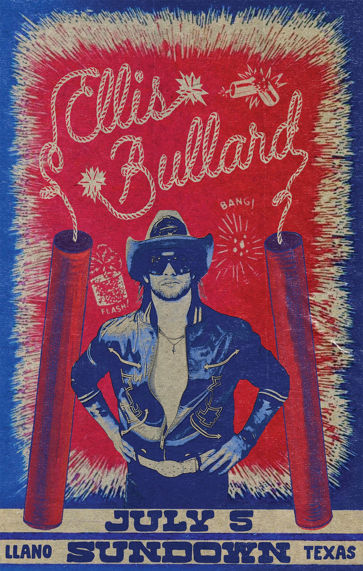
I own and operate my very own honky tonk in Llano, TX called Sundown. One of the best parts about this is getting to bring in some of my favorite artist and being able to create printed posters for their events.
I try to make every poster unique in style so that I can have as much fun creating them as possible, though they all have a vintage feel to them. I’ve pulled inspiration from an old grocery ad, a 1950s coloring book and even old fireworks packaging.
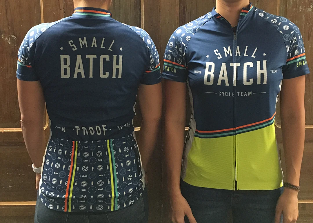
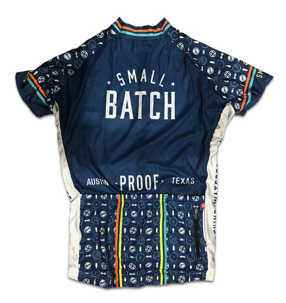
Small Batch Cycle Team was formed when a handful of coworkers got together for training rides in prep for the Livestrong ride. After every ride, we’d end up at a brewery or bar, so it was decided that our team name needed to represent our love of both cycling and drinking.
Being the only designer on the team, the task of creating a logo and jersey went to myself. And, I’m so glad it did because it makes me that much prouder to wear my jersey on rides.
I knew that i wanted a fun pattern and I spent hours working to couple icons that represented booze and bikes but held similar shapes. This wasn’t as easy as it seems, but the exploration was fun.
The project came full circle when Livestrong used our team photo to promote the upcoming ride.
my role: co-design and production
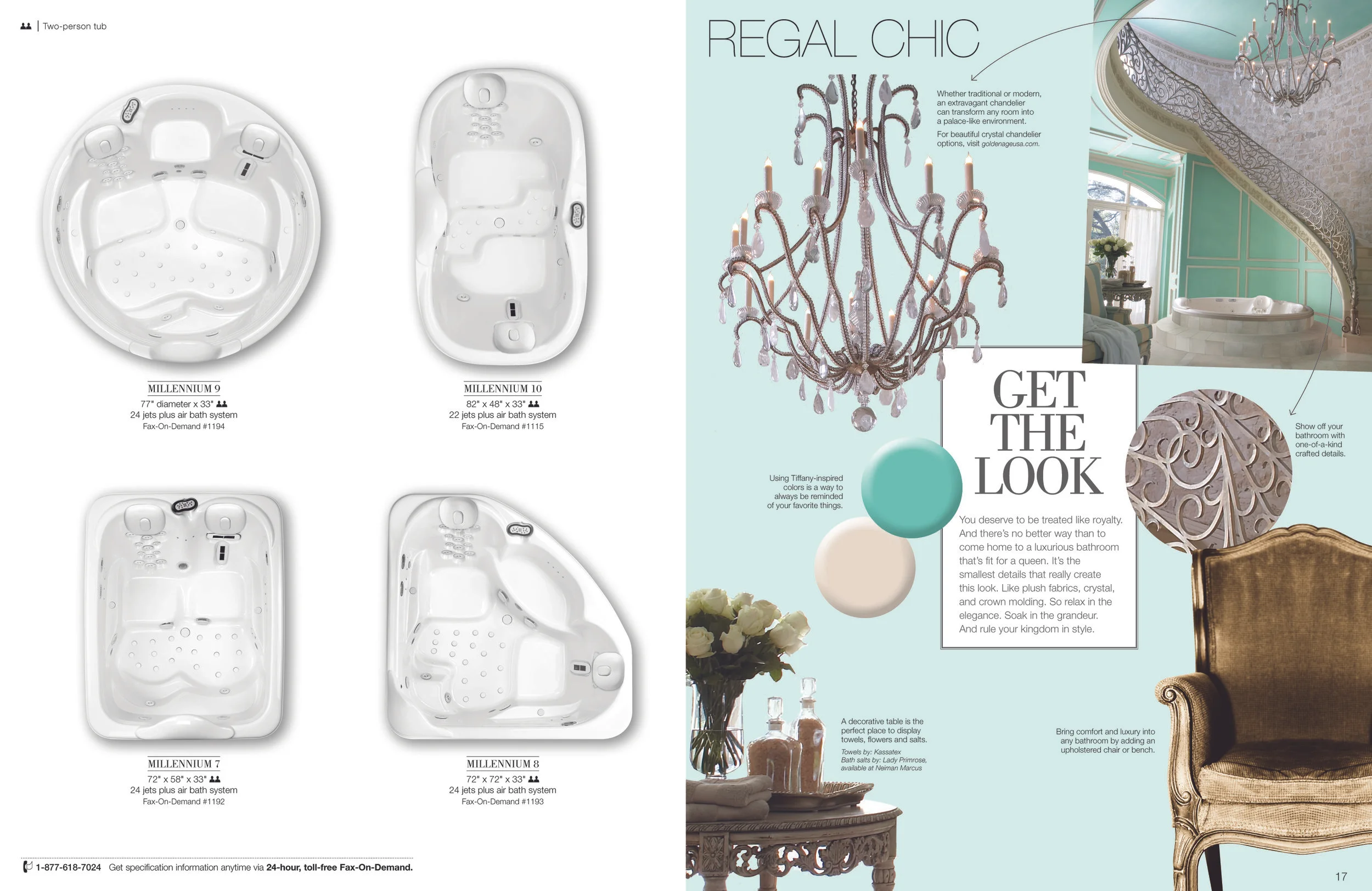
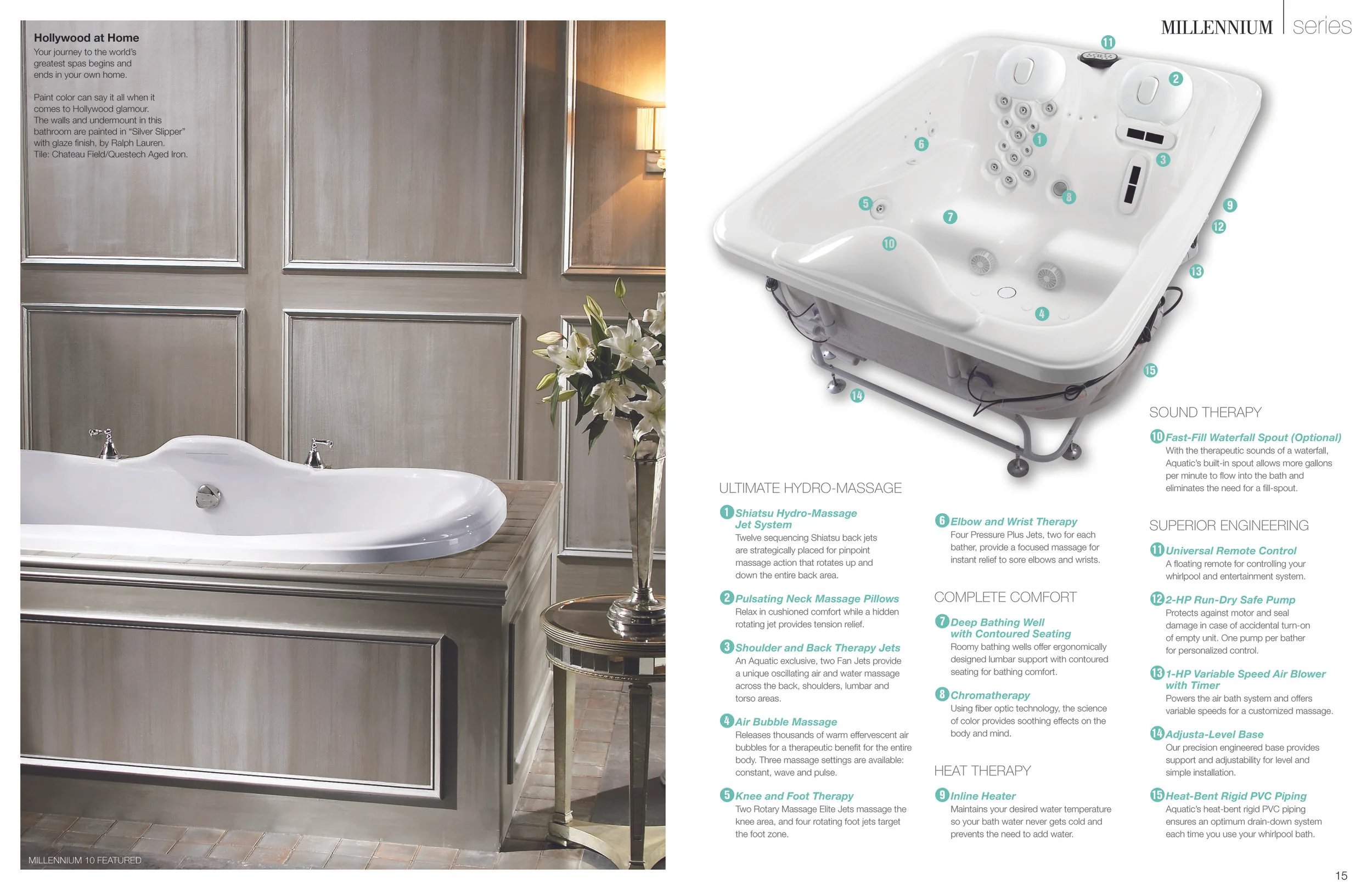
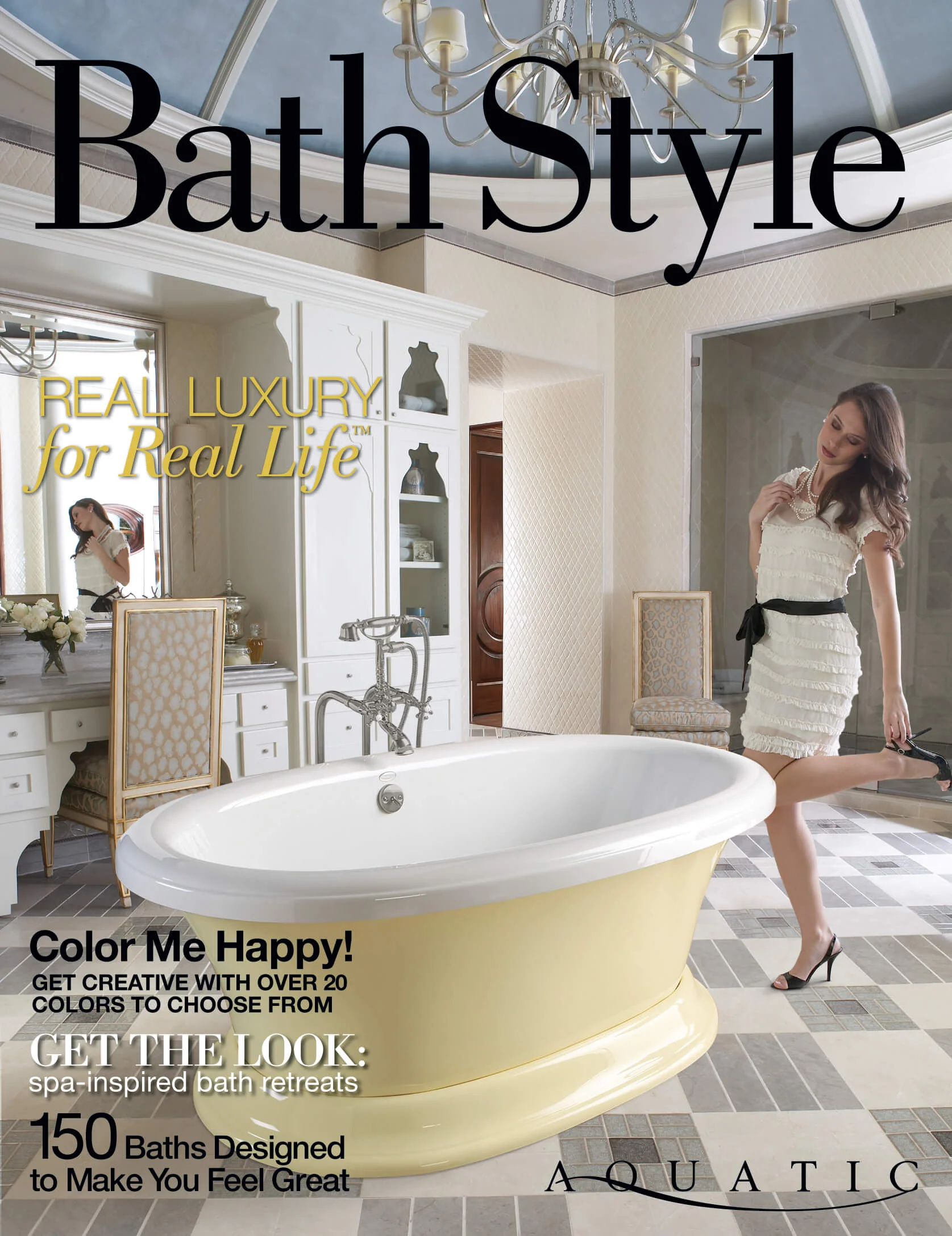
Aquatic Bath was a high-end bath and whirlpool retailer who wanted to redesign their printed catalog. A talented and fashion-minded art director had the idea of creating a magalog and I was brought in to help make this happen. I designed many of the spreads and title pages and did the production work for the catalog. The catalog was so successful, we teamed up the following year to do their next take on the magalog.
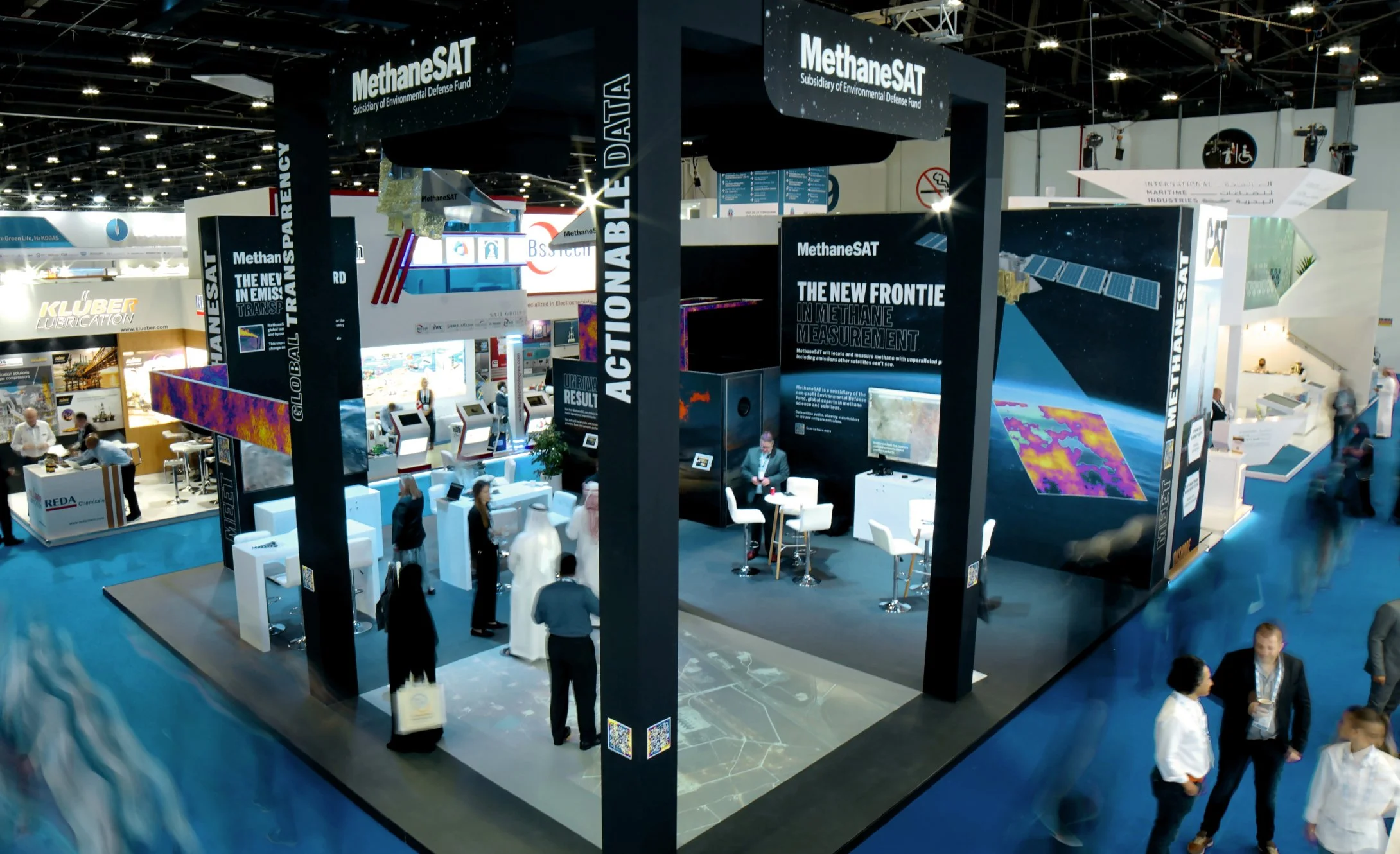
Environmental Defense Fund’s MethaneSAT is new satellite that detects and records high levels of methane emissions.
They introduced the plans for the satellite at the world’s largest trade show of the energy industry and I was tasked with designing a space that was both innovative and informative.
The final result had a small-scale replica of the satellite hovering above with an interactive projection mapping experience.
I also created a companion website that tells the story of MethaneSAT’s capabilities.
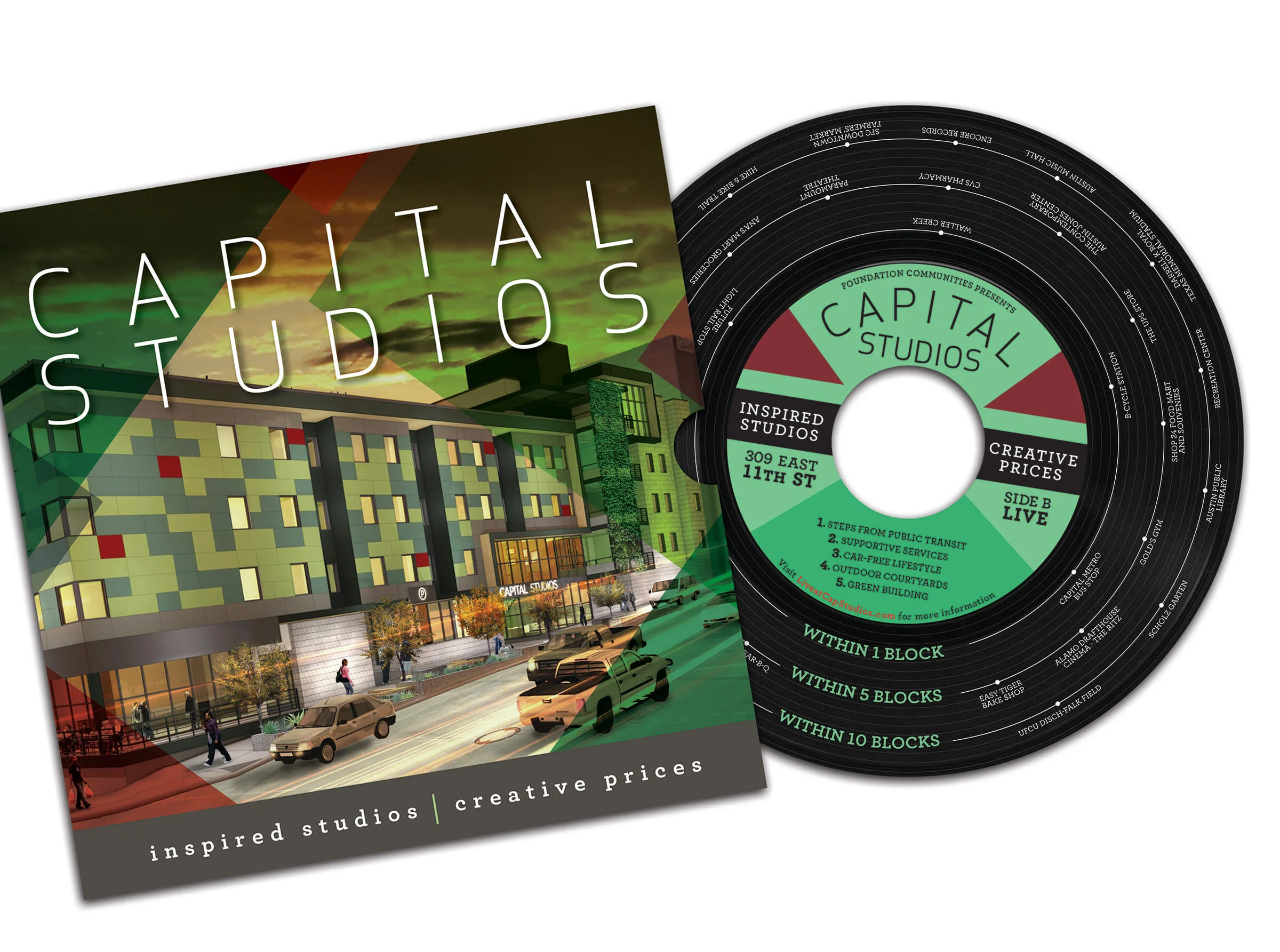
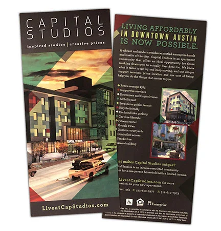
Capital Studios, part of Foundation Communities, is affordable housing in downtown Austin who’s residents are all musicians and lower-income downtown bar and restaurant workers.
The client wanted a printed piece that they could hand out around town that would be appealing to a younger, hipper audience. I designed the piece to look like a record album which highlights several walkable, nearby attractions. This is important because Capital Studios is a community with a car-free lifestyle and has no resident or guest parking available. The A side of the “record” features nearby places to work, with the B side featuring places to play.
A companion brochure was added to the project as well as signage for the building during construction. The construction signage proved challenging because there were 19 panels and each one is unique. All of the triangles align with the ones on the next panel, taking into account the incline of the street and the angles of the construction fence. I took several pictures and took many measurements to ensure that the panels would align perfectly. The end result was pretty dead-on.